Tuesday, April 29, 2008
My Book update...
So I just thought I would throw in that I got an email two days ago saying my book was shipped! I am so excited to see the final product. AwooHoo!!
Skot Olsen


I am a huge fan of painting. That is my art of choice, although I have really been getting into photography. I googled painters and I found this acrylic painter, Skot Olsen. His work deals with human condition through paintings which are cartoonish in style with somewhat realistic rendering. I really enjoy the colors in his pieces. They come to life in a way. Although they are cartoonish, they are somewhat hilarious and depressing at the same time. I relate to his style of painting although it is not my personal style. I am a more realistic painter, but what I respect about him is that he is portraying what is real in his mind through these fantasy images. I feel that imagination is what creates fascinating artwork.
Duby Tal


Cover, Book on Dead Sea by Duby Tal, I felt, was an amazing photograph because of the great texture and bold colors. The image doesn’t look like the Dead Sea; it is full of textures from the salt that forms pocket like holes. The contrast of the white from the salt and the turquoise blue water add interesting contrast the Israeli landscape behind the water. This image is a very realistic shot, but at first glance, it almost appears abstract. This is why I was drawn to this piece first.Another image by Duby Tal that intrigued me was called Dead Sea Sinkholes. This image really plays up drastic color and pattern, as well as texture and unity. At first, I did not understand what the image was, then I read about how the sinkholes are formed in the Dead Sea and I found it interesting that each sinkhole captured in this image was a different, bold color. It really draws the viewer’s eyes to the sinkholes first. As a mirror image of the brown, green and orange sinkholes, in the water to the right are three more sinkholes, but we see them under the water in what appears to be a deeper part of the Dead Sea, making them look like shadows of the sinkholes on the left. Like I said before about the first image, I like how Tal makes a realistic image look abstract. I like how his images are bold. He is very inspiring to me. Although all my images in my book are black and white, I can only hope that they are as beautiful as his images are. These photographs are absolutely amazing!
Edward Burtynsky


Nature transformed through industry is the theme in Edward Burtynsky's work. He takes photographs of industrial landscapes and, with his amazing talent, makes something we normally view as ugly and make it so we view it as beautiful. Recycling yards, mine tailings, quarries and refineries are all places that are outside of our normal experience, yet we partake of their output on a daily basis. These are the places Burtynksky uses to produce his photographs. As Burtynsky says, "Our dependence on nature to provide the materials for our consumption and our concern for the health of our planet sets us into an uneasy contradiction. For me, these images function as reflecting pools of our times".
Edward Burtynsky's Manufactured Landscapes are absolutely amazing photographs. I viewed these photos at the MoPA a year or so ago and they are massive images with great content. After refreshing my memory of the images online, I wish his pieces were back at the MoPA so I can go see them again. Burtynsky is very talented and creative.
Edward Burtynsky's Manufactured Landscapes are absolutely amazing photographs. I viewed these photos at the MoPA a year or so ago and they are massive images with great content. After refreshing my memory of the images online, I wish his pieces were back at the MoPA so I can go see them again. Burtynsky is very talented and creative.
Monday, April 28, 2008
Travis White


He is a young and up and coming artist. He creates posters for shows as well as events in general. But his main focus is band art. He has created everything from CD covers to posters bands sell as merchandise. I really like his style. It is very unrealistic figures but they are very realistic looking. He has also recently been trying out painting. He has always worked with sketching then transferring to Photoshop and making poster there. Now, he is taking his images and transferring them to canvas' and creating these ultimate masterpieces. Overall, I really appreciate the effort and time that goes into each piece.
Ernest Silva


Again, on that same field trip to the Escondido Center for the Arts Museum, another artist whose work was displayed was Ernest Silva. He drew inspiration family photographs and expeiences to create his works of art. He used acrylic on canvas, but I have to say that his technique was very different from any artist I've seen thats used acrylic. He would water down his paints and have them dripping down his pieces. The paint looked like it could have been watercolors instead of acrylic. Some of his pieces were painted on canvas' but then once hung on the wall, a frame and boarder was painted directly behind the piece on the wall. It gave great demension, it really looked 3D. Out of the three artists I've talked about from my visit to this museum, I have to say that visually, he was my least favorite, but peronally, really hit home with the images he portrayed.
Raul Guerrero

On the same field trip for my installation art class to the Escondido Center for the Arts Museum, I was also intrigued by an artist called Raul Guerrero. He is an artist that exolores the notion that a sense of history is of the utmost importance. His work that was displayed was very culturally enhanced. He had a lot of works that combined the Mexican and American culture. The work that I really liked were the two pieces entitled Mexican and American Food Chorizo Combination: La Posta, 2006 and Mexican and American Food Hot Dog: Wienerschnitzel, 2006. They were both oil on canvas'. I really liked all of the bright colors and the play on food with faces. Maybe another reason why I love these pieces so much is because I am completely obsessed with Mexican food...yummy!
Jean Lowe


I went to the Escondido Center for the Arts of April 17th for my installation art class. There were many artist to view. Jean Lowe was my favorite. She had the 44 x 94 inch canvas' on the wall. All of them were oil paintings. The series was called Landscape. The whole idea behind her work was to show the physical expansion of consumerism in America and also to show the time that has gone by a land that once was. I think that the absence of people in her images really allow for a different consideration of these artifical environments where we pass so much of the time. I really liked the image Landscape (Corridor). The image had demension and looked realistic and had depth but from up close, you could see all of the imperfections, its almost as if the painting went from realism to abstract. Overall, I loved her use of color, her techniques that vary the way the audience views her images. As an overall collection, I felt the theme really worked well with the images produced.
Tuesday, April 22, 2008
Christoph Draeger

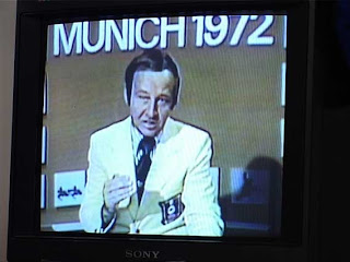
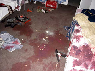
For my installation art class, I had to research an installation artist. I found Christoph Draeger to be very inspirational. He bases all of his works off of disasters and catastrophes. He also is inspired by Hollywood films and mass media. His work is very crowded and all over the place, but there is a since of organization in his madness. It is very easy to see the effort that went into each of his pieces. I really enjoyed the piece called Black September. It is an installation that recreated the 1972 terrorist attack on the Israeli Olympic team by the terrorist group called Black September. It was the first widely shown terrorist attack on television. The details that went into this recreation amazed me. He used live models as the dead bodies on the ground and the space he created for the incident looked exactly like the hotel room that it happend in. Also, I feel that the television in the room that played the recorded footage from that day gave this whole installation more emotion. It made it real and in your face. This is what Draeger wants. He wants to evoke certain emotions from people, good or bad. he also wants people to realize that although these disasters happen every day, we are powerless to stop it.
Monday, February 25, 2008
Monday, February 18, 2008
Thursday, February 14, 2008
Patrick's Benifit Concert, Event #1


On Thursday, January 31st, I went to Patrick's Irish Pub to view an acoustic concert. It was a benefit show to raise money for a new concert venue in Poway. My friend was the one to organize this fundraiser because he feels that the San Diego music scene is not as strong as it use to be. Each band that played was recorded. All of the proceeds from the album sales will go toward this new venue as well.
One of the bands was called Arm the Angels. Their sound, I would say, is a mixture of AC/DC meets The Police. I have seen them live, which is amazing, but acoustically, it was a completely different experience. The quality of the instruments together and the gentleness of the performance really made me like them even more. They played a song that I had never heard before. It was a very romantic song, and compared to their other songs which is all about heartbreak, I would have to say that it was a wonderful breath of fresh air. Overall, I really enjoyed the show.
Also, to help out my friend who is trying to get this venue opened, I was able to help him out and take photographs of the show. Many of these images will be printed on the album and will be posted on the website my friend built to keep people informed about the upcoming shows.
It truly was a great experience.
Tuesday, February 12, 2008
Oliver Herring

Out of all of the artists' that we viewed today, I like him the best. I like how he wants to make this personal connection with complete strangers.
His combination of painting and photography is very unique. I would never think to ask someone, especially someone I don't know, to spit food dye out of their mouths, get it all over their bodied, then photograph them afterwards.
I think that this concept is very clever and creative. His images are beautiful and amazing. I especially like the eyes in the images of the men with paint all over them. He seems to pick the colors that really compliment their eyes and make them pop!
Saed Menshki

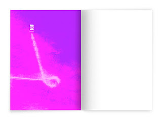


Well, I cannot really get a sense of what he is about just through the images that I see. He really likes to use bold colors in certain books and in other books, it is just about black and white. I can say that, like Reza Abedini, he also has a really wonderful design aesthetic that is very pleasing to the eye. His images draw you in to take a closer look.
Reza Abedini

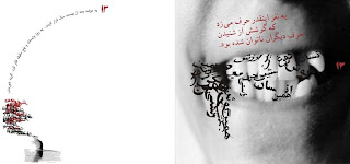
I am impressed with the design in many of Reza's pieces. Although, I cannot read what his images are about, due to the language, I am forced to look at his pieces just on design. I really enjoy his use of color and space. I am the type of person, like Deborah, that uses every last space on the page. I hate white. With his images, it works as a good element of design. It gives a sense of organization and calmness and it really forces the viewer to look at each element in the piece. In other works, I like the color combinations are amazing. He really understands how to create certain moods just with color. Which is a good thing because if you are not from his country, you will not understand the words on his pieces, and his pieces are mainly composed of words.
Overall, I really am inspired by his unique design elements. It makes me think outside of my box.
Arturo Herrera
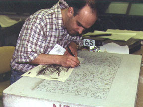 Artists' are weird creatures. Every artist has their own way of working, no matter how weird it may be. Herrera seems to be very passionate about his type of work, and although I found him to be a bit strange, I find his work very inspiring. I like how he takes the most simple image, photographs it, then soaks it in water, develops it, and then to top it all off, he connects all the images to make a huge wall piece. Each image, separately is unique, but as a whole, comes together and makes this amazing image.
The water damage adds unique texture to each individual image, which is cool. But standing far back to view his piece as a whole, you wouldn't be able to see all of those imperfections. Thats another reason why I like his style because it works not only individually, but as a whole.
Tom Scott
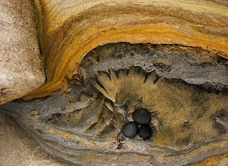
I have always been in love with the beach. I really enjoy his photographs. I like how each image has a distinct and unique pattern. Although, compared to the black and white images of the sand and rocks, I enjoy the colored images better. I like the contrast between the dark colors of the sand and the bright shinny colors of the rocks. He has a very creative eye. Scott's images make me want to go back to the beach and look at it in a completely different way.
It is funny, every time I go to the beach, I notice the unique patterns in the sand that the water makes on the shore, but I have never thought of photographing the sand that close up. His images are truly beautiful.
Tuesday, February 5, 2008
The Past Nine Years.
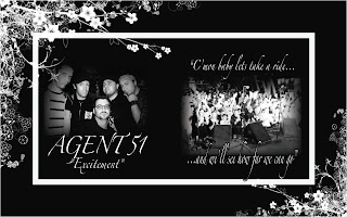
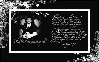
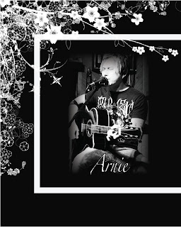
Just recently I have been going through all of my old photos and letters. I have so many boxes in my room of photos and negatives. I started to think back on all of these amazing times I have had with my friends and family. After signing up for this class, I thought that it would be a really fun idea to take many of the old pictures I have, along with new ones and create a book of all the people in my life.
Nine years ago I met my boyfriend. I was sixteen. At sixteen, you really have no sense of what you want to do when you are older or really have any sort of strong direction, except for the one pointing out of high school. My boyfriend was in a band at the time, and still is, but after meeting him, I met so many talented, artistic people who expressed themselves through their passion, which is art, musically and visually. All of these people inspired me to follow my passion, which is visual art. They have guided me, inspired me and been the best prayer I could ever have answered.
My younger years were tough, but I got through them. My family always meant so much to me. After I met my boyfriend, they saw such a positive change in me. They were so supportive of the changes I had made in my life. They were there for me through the good, the bad and the ugly. They stuck by my side and believed in me.
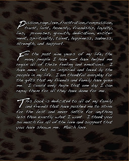
My book will be a document of the last nine years of my life and I want to dedicate it to all of the people that helped get me where I am today. I want to portray all of my friends and family in a way that lets them know how much I appreciate them and I want to glorify all of their amazing talents and passions. I want to show and express how much of an influence they have been on my life.
Tuesday, January 29, 2008
Stefan Sagmeister

It's funny that he was saying how being in crappy bands when he was younger got him into designing band covers today. I know a couple of people who have been in bands and from that experience, got into designing album covers and posters for shows. It is real important in any album cover or poster that the lettering and design be something that is appealing to a general audience as well as a specific type of audience because that is the type of promotion that gets people to the bands shows as well as buying the albums.
Subscribe to:
Posts (Atom)


